As part of a small design systems working group within the Xfinity design organization, I helped lead an initiative to bring structure and alignment to an existing design system that had become fragmented across teams, platforms, and files. When the effort began, there was no clear source of truth, documentation was minimal, and components were inconsistently implemented across the Xfinity.com experience.
Our goal was to establish a scalable foundation that could support the broader site while reducing duplication and improving collaboration between design and engineering. We began by auditing existing patterns and defining shared tokens for typography, color, and foundational styles. From there, we developed a set of reusable components and page templates designed to scale across the various product, marketing, and self-service surfaces on the site.
Because ownership of different areas of the experience was distributed across multiple teams and backend systems, the work also required building new partnerships across the organization to clarify responsibilities, align on system standards, and understand the technical environments supporting the site.
The result was a unified, component-based system that established a clear source of truth for the design team and improved consistency across Xfinity.com. The system continues to be used and iterated on today as new features and campaigns are developed across the platform.
Surface area: Xfinity.com (web)
Focus: Learn pages, merchandising, and sales funnel
Secondary alignment: Self-service experiences
Design team: 4 designers
Broader collaboration: ~30 partners across design, content, engineering, and marketing
This work was not attached to a formal roadmap initiative. We had to evolve the system while supporting daily production updates and ongoing marketing campaigns.
Over time the site accumulated multiple parallel patterns:
This created operational cost more than visual inconsistency:

We cataloged duplicated layouts, color drift, typography inconsistencies, and messaging fragmentation. Instead of redesigning individual pages, we identified repeatable behavioral patterns shared across the experience.
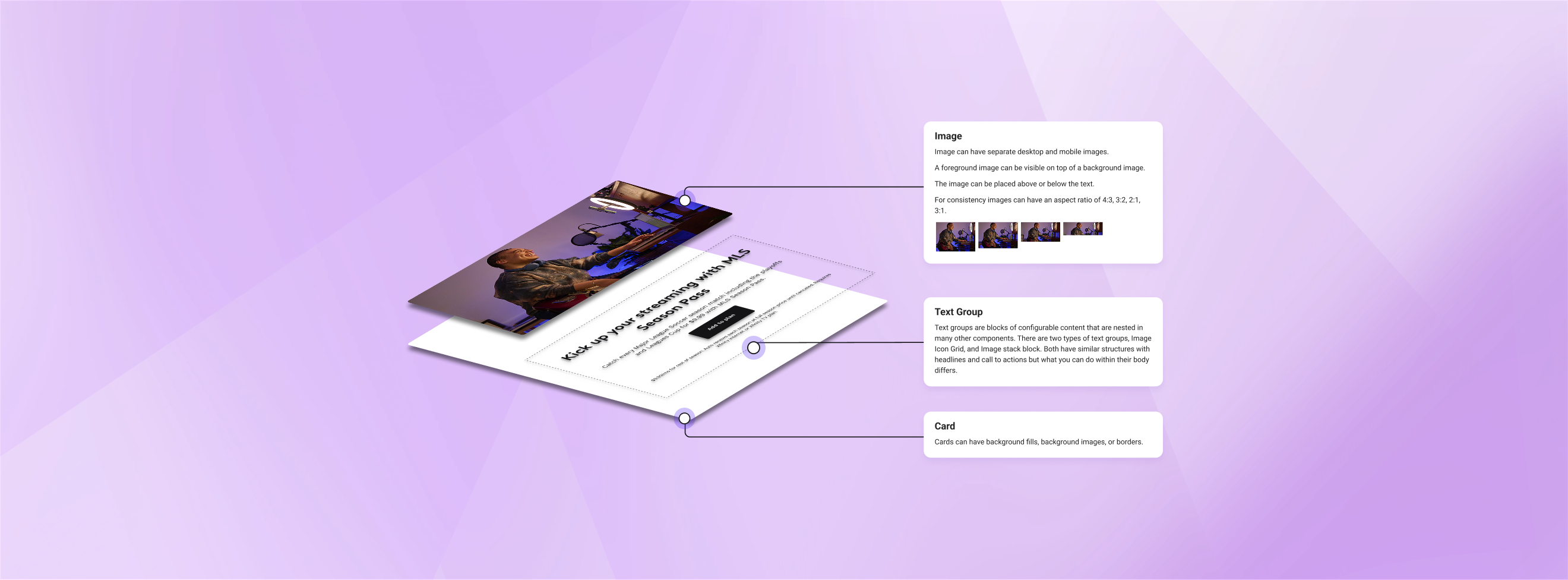
We replaced hard-coded styles with structured tokens:
These tokens mapped directly to production code, ensuring parity between design and implementation.
We rebuilt common modules including:
Each component included responsive rules, variants, and content constraints so marketing no longer required custom builds for campaigns.
Because engineering bandwidth was limited and the effort was not a formal initiative, we embedded system updates into existing tickets.
For example, during a major promotional campaign we shipped updated components alongside required marketing changes. This allowed us to modernize the experience gradually without disrupting delivery timelines.
We aligned layout logic, messaging patterns, and interaction expectations between sales and logged-in areas of the site. The experience shifted from separate product pages to a cohesive family of services.
The system extended beyond UI. By tying content to component structure:
Design and content moved from isolated page creation to shared narrative architecture.
Within the team:
Operational outcomes included:
Most importantly, the site transitioned from independent pages to a connected experience.
Designers, developers, and content partners were now working from the same system — and that system mapped directly to production.
This work demonstrates my approach to design systems: